Monday, 26 March 2012

CD Changes

 Class Feedback
This design for our CD and back cover recieved some good feedback and compliments. Comments were made about the very effective continuity through the use of the lips being repeated throughout the digipack. However, one thing that was critisized was the dull back ground of the CD. The blue background seems a little boring to the rest of the digipack and we were given a few ideas to make it a little more interesting:
 
  • Write something behind the CD like 'Love Elle x', or just simply 'Elle x'. These come across as quite personal and rather signature like, which we quite liked the idea of.
  • Pasting a set of lips in the centre of the back ground to mimick the CD
  • Carry on the theme of lips by lining them up once again at the back of the CD.
Here are some designs:


As a group we discussed that this suggestion was our favourite, therefore I have designed these two designs to simply make the back ground of the CD look slightly more interesting. I rotated the writing on the right example as Sarah suggested it to see what it would look like. As a result of this, we all preferred the tilted design. It is simple, personal and yet effective. The font we used is exactly the same font we have used on the front of the CD. I chose this font for continuity reasons. Keeping the same font makes the digipack overall more effective.

 Below is the background with the CD:


Friday, 23 March 2012

Re-shooting Scenes

Again, I was unable to attend this filming session due to work commitments but I will publish some of the problems the group encountered whilst filming this time.

MAKE UP:
As we were refilming what we had already done, we needed to ensure that Ellie's make up was identical to the first shoot that we did. I did Ellie's make up last time and the group did pretty well to make it identical to the last time without me there!


SETTING:
As well as the make up, we needed to make sure that the setting in the room was reflective of the previous scenes so that the film has continuity.


FILMING:
In our footage before, our clips were rather boring and repetitive. The group managed to find different ways of shooting from different angles in order to give the film a bit more excitement.

Tuesday, 20 March 2012

Filming Day 2

Unfortunately due to my performing arts lesson, I was unable to attend the filming that was done when re-shooting parts of our video. However, here are a few examples of how my group got on:

Below is a filming schedule that Sarah made so that when the day of filming came, they knew exactly what was needed to film, where, and what props were needed.

FILMING


As usual, they began by setting up the lights in a particular way to avoid having footage that is too dark. They had to position them correctly as to avoid glare from windows or mirrors and to make sure that the lighting was not in the camera line.

They tried many different shots at different angles to see what angles looked best or the most effective. Ranging from high angles to eye-shots to close-ups.


CD Development

I began drafting the CD by coming up with a few ideas. First of all, I thought we could use Ellie's lips as a continuing theme on the CD. They would match the colour of the front CD cover and of course there is a direct link between the CD picture of the lips and the front cover.

I cut the photo above from the original photo on the front cover of the CD. At first I just started by cutting it out very roughly, then pasting it onto a new file on top of a CD base. As you can see below, I have taken the lips directly from the original photo to show continuity. The design below was only my first design so is very rough. The edges will need to be sharpened and the lips will need to be made redder and brighter to match the original.

The designs below are a few that I came up with as a starting point. Using the idea of repetition from my research, I took time to repeat the word 'Ignorance' over and over again. I think it looked effective but I wasn't entirely happy. The word was written in black, whereas on the front cover, 'IGNORANCE' is written in red. The lack of continuity bothered me and I tried some other ideas. The idea of putting the name of the artist, the song and the lips across the middle of the CD was a favourite of mine. I liked the way the lips represented the original lips on the photo on the front of the CD but I thought this design seemed a bit boring and it needed to be more exciting. I then came on to copy and paste the lips many, many times to create lines of lips, almost mimicking the paramore wallpaper that I researched. This worked very well and my group was happiest with this design.

As you can probably tell, we had some work to do on the CD. Although it was our favourite, there were a few things we had to neaten. First of all you will notice that the colour of the lips has changed to a brighter, mroe vibrant red. I lost the original colour of the lips when I began to play around with the lips and consequently had to add the colour back in when I was done. The bottom right print screen shows how I cut the lips that were on the outside of the CD by creating a box around the area, then using a circle tool to cut the lips more definitely and sharply. The bottom left print screen has the word 'IGNORANCE' pasted on the CD. It is quite hard to read, however and we soon agreed that this design was probably not the best.

To keep the CD simple and effective, we accompanied the CD with the background of the same blue that is continuous throughout the digipack. Any other colour would have looked to dark and it would not have the fantastic continuity that I have managed to attain throughout the whole development of the digipack.

Disc Research

As we are doing a paramore song, I typed in 'Paramore CD' into google just to see the kind of thing that they did with their digipaks, etc. The picture on top is the front cover of their latest album, and the photo below is a mash up of their 'Brand New Eyes' album and their 'Riot' album to create phone wallpaper. I happened to come across this and had the idea of repeating something over again, like a recurring theme of some sort. Although it is a wallpaper, we can still use the technique of repetition to create something interesting and different.

The Rihanna CD to the left shows the CD cover and the disc itself. When researching into CD's and their designs, I realised that most CD's do not have a photograph on and have some sort of simple pattern or design.


The CD to the left is part of the digipak of The Script. As you can see, the CD is consecutive with the front cover of the CD, with the same design. Also, it has a design rather than a photo, which seems to be the most popular way of designing a CD.

After researching into these CD designs, I think I have decided to use some sort of design on the CD that links in with the front cover of the digipak, instead of using a completely different photograph. The contiunity is profoud in this example and I think it looks a lot more effective that using a completely different design.

Monday, 19 March 2012

Magazine Advert Research

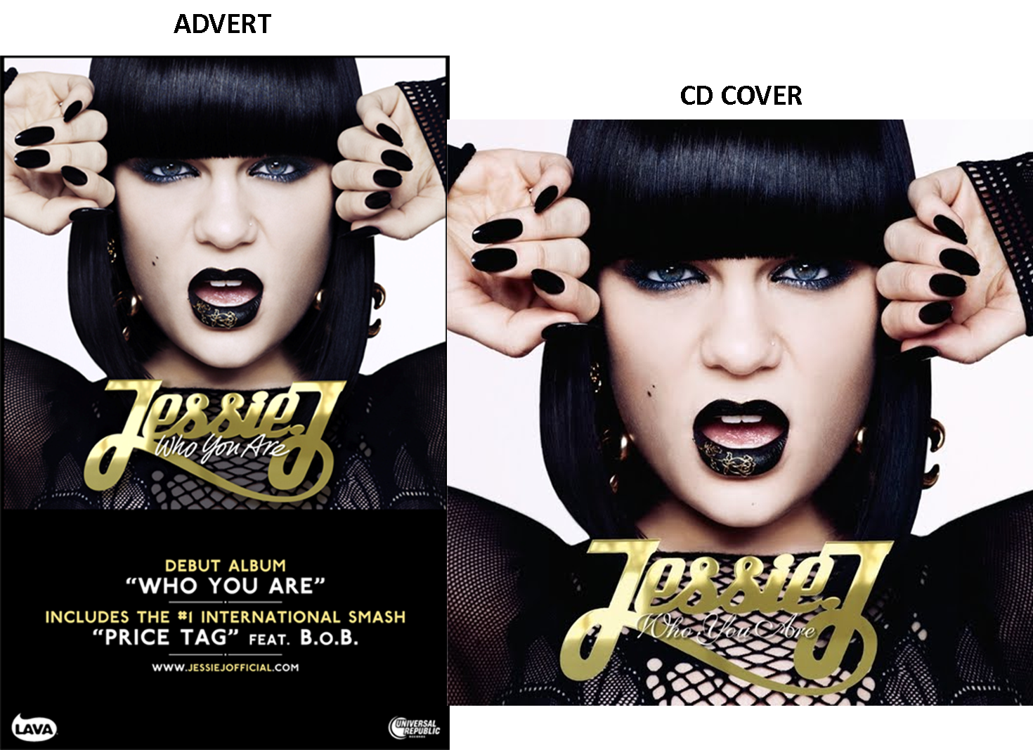
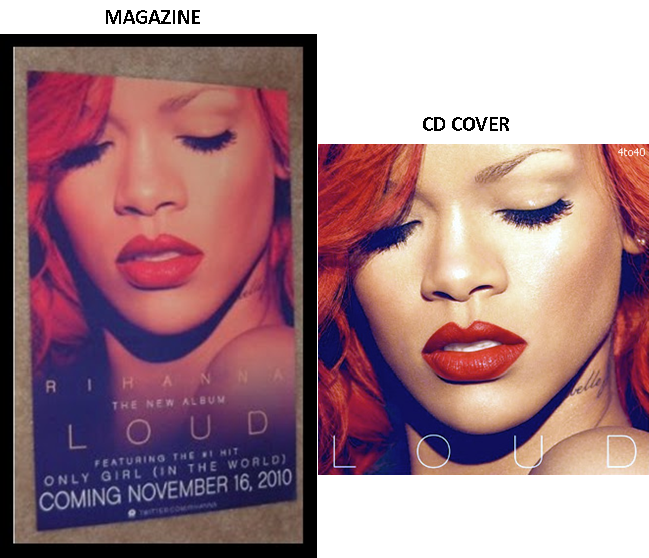
When creating our magazine advert, we did a little research into what picture we should use to link in with the digipack. After some research, we have concluded that most album adverts are advertised using the photo on the front of the album cover. This is something we will take into full consideration when creating our own magazine advert.

All three of these examples include the name of the album, the same colours (like the Jessie J one has a consecutive colour of gold and black), websites in which you can go onto to get details of the artist and most importantly the release date. The Rihanna advert has in big bold letters at the bottom clearly showing when the album will come out. I have realised that there has to be a direct link between the advert and the CD for it to look consecutive and professional.


CONCLUSION

After researching into these posters, I have figured out these few things:

1) The poster almost always has the same photograph on it as the front cover of the digipack.
2) The colours are consecutive and reflect the digipack
3) The date or the 'out now' font is always present on the poster.
4) There is always some sort of reference to other media concerning the artist, like a twitter account or myspace account.
5) More times than none, the font is always consecutive to the digipack.
6) The name of the album is always present on a poster.


Monday, 12 March 2012

Back of CD development

From left to right:

I started off by putting the photograph on the far left because it looked best that way. I felt that after I had put down the names of the songs and the barcode, etc, that something was needed in the top right hand corner. I tested putting a big swirly blob in the corner just to give it an extra something but after looking at it for some time, I didn't think it looked as good as it does without. The last two examples have been changed slightly from the others. My group members alerted me that the top example does not have much continuity with the front cover because the colour looks too bright, so we lassooed the eyes and the lips so they werent involved in the dulling of the photograph as a whole and as you can see both photos look more similar now: