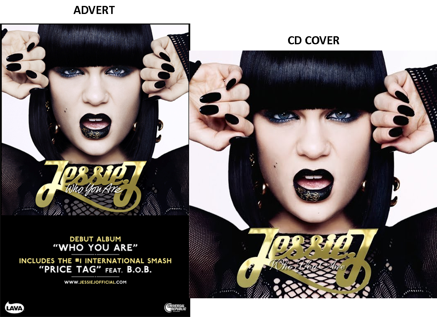
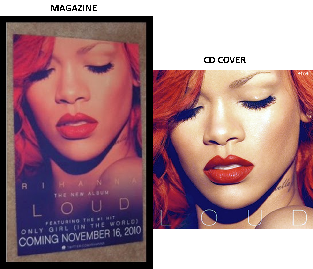
When creating our magazine advert, we did a little research into what picture we should use to link in with the digipack. After some research, we have concluded that most album adverts are advertised using the photo on the front of the album cover. This is something we will take into full consideration when creating our own magazine advert.
All three of these examples include the name of the album, the same colours (like the Jessie J one has a consecutive colour of gold and black), websites in which you can go onto to get details of the artist and most importantly the release date. The Rihanna advert has in big bold letters at the bottom clearly showing when the album will come out. I have realised that there has to be a direct link between the advert and the CD for it to look consecutive and professional.

CONCLUSION
After researching into these posters, I have figured out these few things:
1) The poster almost always has the same photograph on it as the front cover of the digipack.
2) The colours are consecutive and reflect the digipack
3) The date or the 'out now' font is always present on the poster.
4) There is always some sort of reference to other media concerning the artist, like a twitter account or myspace account.
5) More times than none, the font is always consecutive to the digipack.
6) The name of the album is always present on a poster.
No comments:
Post a Comment