Friday, 30 March 2012

Copyright Letter

 
Dear Warner Music Group

I am a Year 13 student at Wilmington Grammar School for Girls in England. I am writing to request your permission to use one track from Paramore’s album ‘Brand New Eyes’, called ‘Ignorance’. With your permission, along with the three other members of my group, I would like to use this track for my Year 13 Media Studies Coursework, which involves creating a music video with a popular and well-known song.

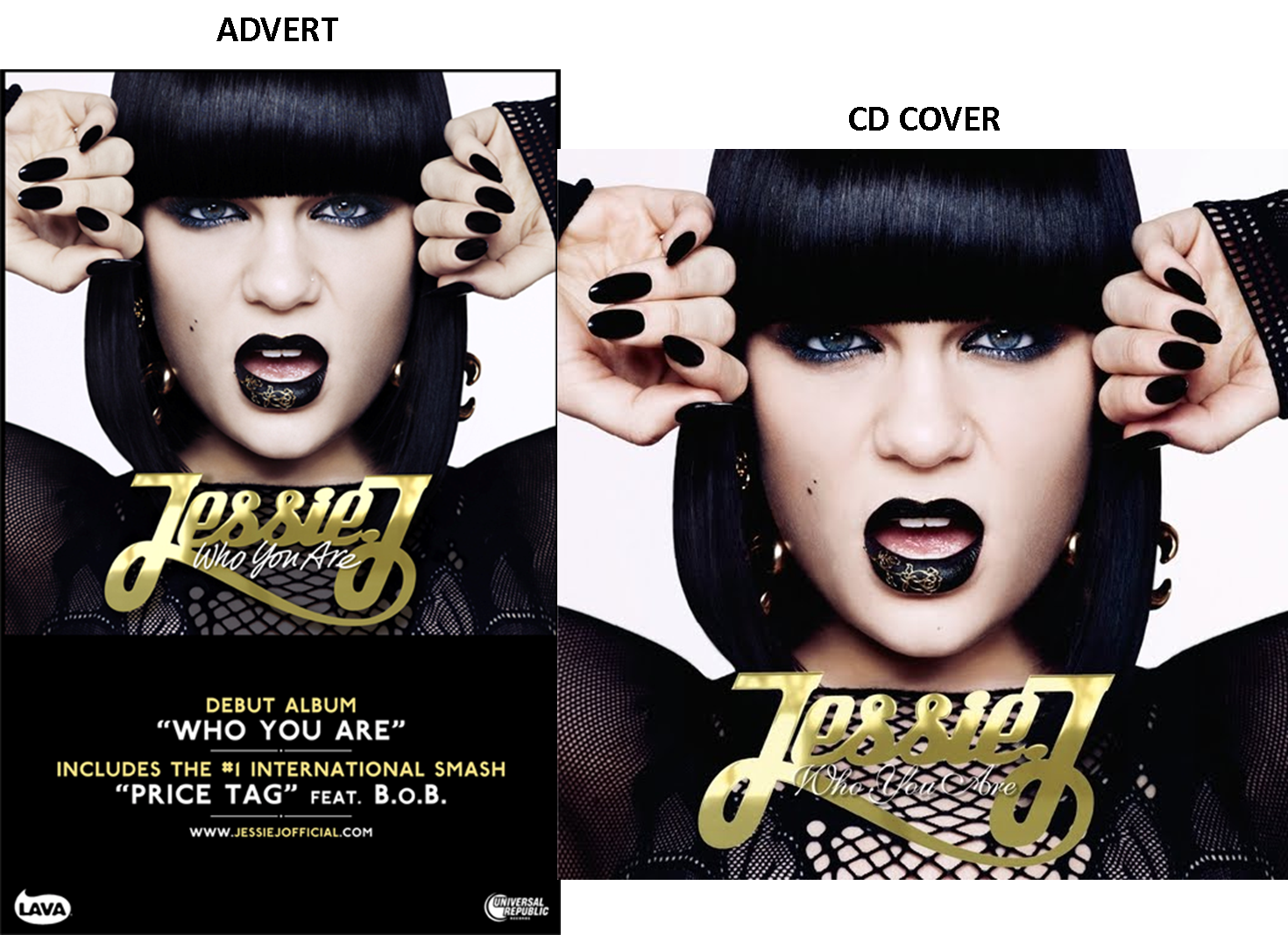
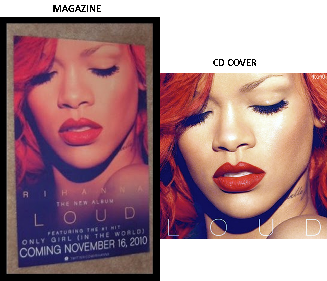
We will also be producing a digi-pack and magazine advertisement which will include the name of the song. If we receive your permission, this track will be used for educational purposes only and will only be viewed by my media class, teachers and the OCR exam board. However, to upload the music video to our coursework blogs we will require uploading the video to YouTube for a short period of time until the exam board has viewed it.

The artist and the company will be fully recognised throughout the pre-production and the music video and a copyright notice supplied by you can be included in the records of the project. If this is required please send full details.

Thank you for your time, we look forward to hearing from you soon,

Sarah Biswell
Zoe Richardson
Charlotte Coe
Sarah Brushett
 
Above is the letter that Sarah wrote to Warner music group so we would be able to legally use the song 'Ignorance' in our video.
 

Time Changing in Music Videos

Like in our own music video, other music video's use different colours to express past and present. Sarah did some research on the time changes in music videos and how it effects the outcome.

webcam to gif

As you can see, in this video by Katy Perry, the top clips are when she is older, obviously the present tense. It is darker and greyer whereas the coloured clips at the bottom are full of life, representing the past.

Effects

One of the main effects of our video is our use of black and white to distinguish the memory scenes from the present day. Below is an example of how we were able to do this. The process included selecting the shots that we wanted to make black and white and then changing the colour of it. It was fairly simple to do but it was time consuming as we had to do each clip by itself as we were not able to highlight many at a time. We tried both colour and black and white themes for the memories and decided that black and white looked better.

This is what the black and white effects looked like:

The black and white is effective because it relates to old films and videos, which are black and white, therefore representing the past.

Cutting

Cutting to the music is essential when editing our video. The printscreen below shows adobe premier and the effects (on the left of the screen) that we could potentially use in the cuts of our video. The following things are essential when cutting our video:

-Ensuring that the separate shots run smoothly
-Making sure the story is easy to follow
-Making sure cuts don't cut into any significant parts of the video
-Ensuring the cuts are in the right places
-Making sure that our flashback scenes are obvious to the audience

The photo below shows some potential effects that we can use when cutting our video to attain effective transitions.


The slide below shows how we have cut one scene from another smoothly. We chose to use black and white for our memory/flashback scenes, then changing to full colour again to represent present time and day. We used a fading transition, which means that one shot will fade into another smoothly, rather than just cutting. We decided to go with this transition as the smooth fade reflects Elle's mind and how she is remembering these memories.
cam to gif

Ideas For Behind the CD

Feedback on Our Digipack

Positives

1) There is a definite and clear connection through the whole of the digipack through the use of colours, font and photographs.
2) The photographs are all very similar, with the costumes being the same and the lips being the exact same colour in every photo.
3) The photoshop effects are all very similar and very well done.
4) The colour blue shows good continuity.

Negatives
1) The back of the CD photo is slightly lighter to the others due to lighting in the photoshoot that was beyond our control.

Feedback on Our Magazine

Positives

1) Effective link between the red lips and the red font for the song title.
2) The ratings for the CD are easy to see and realistic.
3) Although the photo is the same, more of this photo is shown on the advert, which creates an interesting yet effective difference.
4) By using the same photo we are making sure that people purchasing this digipak will know what it looks like when they are searching for it.
5)The date is the largest font on the advert, catching the readers eye and making that date stay in the readers mind.

Negatives

1) There is no record label on the advert.

Feedback on our Rough Cut

Positives

1) We were told that our editing fits very well to the music, cutting to the beat and making it look more effective.
2) Costume and prop choices were very informed, they went well with the bleak atmosphere and the attitude of our actress.
3) The black and white scenes work well as they reflect her memories, shows how they are in the past, contrasting to the full colour of the present day shots.
4) The acting from the actors was very good, it was very believeable.

Negatives

1) The shots where she goes down the stairs in her house, it looks as though the shot shows her going down the top of the stairs twice. We need to make this clearer.
2) The bit where Elle is texting Harry, there is light shining on the screen, making it almost impossible to see what has been written. We need to change this to make it more visible.

Overall

Overall we were given very good feedback and are very happy with our roughcut. We will refilm the negatives that we were given in order to make the video make more sense.

Tuesday, 27 March 2012

Spine of the Digipack

In order to complete our digipack, we need to create a spine for the CD. Most CD spines only contain the name of the artist and the name of the album. Knowing this, we have decided to go along with this idea, using the same fonts we have used on the digipack already.

Going by the height of the CD we had to estimate the height and width that the spine would be. 

This is our first draft:

This is our second draft. We have added two circles around the writing to create more of an effect:

After playing around with the dots, we came to the conculsion as a group that the dots made it look a little childish. So we have resorted to the original design:

FINAL


Final Magazine Poster

Final Digipack Pieces

Rough Cut


This is our rough cut that we have been working on for quite some time. There are still a few bits that need tweaking but we are almost finished. When we have finished the final cut, we will put it onto facebook and get some feedback from our friends on there to see what they think is good and what the think is not as good.

Bits we need to re-film

1) The scenes where Elle is walking along the street outside her house needs to be refilmed as there is no real relevance to it and we need to make it a little more interesting with more frequent cuts so it fits the music.
2) The scene in which Elle says 'Ignorance is your new best friend' needs to be refilmed as the lighting changes quite drastically in this scene from being outside to inside, making it look rather light and happy whereas the atmosphere should be a little more melancholy.


Magazine Advert Update

After some debate and research into magazine adverts, I have decided to create the advert based on the front cover of the CD. This way, people buying the CD can relate to the advert and recognise the CD easily when coming to buy it. I have noticed in my research that all good adverts have a clear link to the digipack. If there was not a connection, buyers would be less inclined to purchase the CD as they would not know what it looks like. 

This is why we are going to use the exact same photograph that is on the front of our CD. This obviously shows continuity and consumers will be more likely to buy the CD if they know exactly what to expect on the front of the CD.

Beside the photograph, here are a few things that I have included in the magazine advert that my research showed completely necessary if you want to make a successful and effective advertisement:
As you can see, we have stuck to a lot of the same fonts, colours and ideas that are correspondant throughout the digipack, keeping both products similar.


FINAL POSTER

Monday, 26 March 2012

Problems in Editing

Making and Devloping the Magazine Advert

Construction of the Magazine Advert

 The two plans above are drawings we made as a plan for the layout of our magazine advert.

These designs above are a few more examples we came up with. The top left one shows Ellie in the middle, with the 'other girl' far behind her and the boy in the film to the right of her. The top right photo shows Elle to be leaning against a wall, looking casual, quite like the bottom right in which she is standing in a road. The bottom left one shows Elle to be blowing a kiss, but for the type of song that it is, personally I don't think this sweetness is the right photo to go with.

The example to the left is a photograph from our first photoshoot. It shows Elle to be leaning against the wall, quite like the drawing we made as an example. This could be an idea for our magazine, so we blurred the background around Elle to give an effect of time passing. With this design however, the blue font clashes with the background and is a little hard to see.
When researching into magazine adverts, I found that most magazines advertising music go along with the same theme as the digipack. In realising this, Zoe took it upon herself to create a vague drawing of what the magazine would look like, considering I have already created the digipack.
The image on the design will be the same as the front cover of the CD.

CD Changes

 Class Feedback
This design for our CD and back cover recieved some good feedback and compliments. Comments were made about the very effective continuity through the use of the lips being repeated throughout the digipack. However, one thing that was critisized was the dull back ground of the CD. The blue background seems a little boring to the rest of the digipack and we were given a few ideas to make it a little more interesting:
 
  • Write something behind the CD like 'Love Elle x', or just simply 'Elle x'. These come across as quite personal and rather signature like, which we quite liked the idea of.
  • Pasting a set of lips in the centre of the back ground to mimick the CD
  • Carry on the theme of lips by lining them up once again at the back of the CD.
Here are some designs:


As a group we discussed that this suggestion was our favourite, therefore I have designed these two designs to simply make the back ground of the CD look slightly more interesting. I rotated the writing on the right example as Sarah suggested it to see what it would look like. As a result of this, we all preferred the tilted design. It is simple, personal and yet effective. The font we used is exactly the same font we have used on the front of the CD. I chose this font for continuity reasons. Keeping the same font makes the digipack overall more effective.

 Below is the background with the CD:


Friday, 23 March 2012

Re-shooting Scenes

Again, I was unable to attend this filming session due to work commitments but I will publish some of the problems the group encountered whilst filming this time.

MAKE UP:
As we were refilming what we had already done, we needed to ensure that Ellie's make up was identical to the first shoot that we did. I did Ellie's make up last time and the group did pretty well to make it identical to the last time without me there!


SETTING:
As well as the make up, we needed to make sure that the setting in the room was reflective of the previous scenes so that the film has continuity.


FILMING:
In our footage before, our clips were rather boring and repetitive. The group managed to find different ways of shooting from different angles in order to give the film a bit more excitement.

Tuesday, 20 March 2012

Filming Day 2

Unfortunately due to my performing arts lesson, I was unable to attend the filming that was done when re-shooting parts of our video. However, here are a few examples of how my group got on:

Below is a filming schedule that Sarah made so that when the day of filming came, they knew exactly what was needed to film, where, and what props were needed.

FILMING


As usual, they began by setting up the lights in a particular way to avoid having footage that is too dark. They had to position them correctly as to avoid glare from windows or mirrors and to make sure that the lighting was not in the camera line.

They tried many different shots at different angles to see what angles looked best or the most effective. Ranging from high angles to eye-shots to close-ups.


CD Development

I began drafting the CD by coming up with a few ideas. First of all, I thought we could use Ellie's lips as a continuing theme on the CD. They would match the colour of the front CD cover and of course there is a direct link between the CD picture of the lips and the front cover.

I cut the photo above from the original photo on the front cover of the CD. At first I just started by cutting it out very roughly, then pasting it onto a new file on top of a CD base. As you can see below, I have taken the lips directly from the original photo to show continuity. The design below was only my first design so is very rough. The edges will need to be sharpened and the lips will need to be made redder and brighter to match the original.

The designs below are a few that I came up with as a starting point. Using the idea of repetition from my research, I took time to repeat the word 'Ignorance' over and over again. I think it looked effective but I wasn't entirely happy. The word was written in black, whereas on the front cover, 'IGNORANCE' is written in red. The lack of continuity bothered me and I tried some other ideas. The idea of putting the name of the artist, the song and the lips across the middle of the CD was a favourite of mine. I liked the way the lips represented the original lips on the photo on the front of the CD but I thought this design seemed a bit boring and it needed to be more exciting. I then came on to copy and paste the lips many, many times to create lines of lips, almost mimicking the paramore wallpaper that I researched. This worked very well and my group was happiest with this design.

As you can probably tell, we had some work to do on the CD. Although it was our favourite, there were a few things we had to neaten. First of all you will notice that the colour of the lips has changed to a brighter, mroe vibrant red. I lost the original colour of the lips when I began to play around with the lips and consequently had to add the colour back in when I was done. The bottom right print screen shows how I cut the lips that were on the outside of the CD by creating a box around the area, then using a circle tool to cut the lips more definitely and sharply. The bottom left print screen has the word 'IGNORANCE' pasted on the CD. It is quite hard to read, however and we soon agreed that this design was probably not the best.

To keep the CD simple and effective, we accompanied the CD with the background of the same blue that is continuous throughout the digipack. Any other colour would have looked to dark and it would not have the fantastic continuity that I have managed to attain throughout the whole development of the digipack.

Disc Research

As we are doing a paramore song, I typed in 'Paramore CD' into google just to see the kind of thing that they did with their digipaks, etc. The picture on top is the front cover of their latest album, and the photo below is a mash up of their 'Brand New Eyes' album and their 'Riot' album to create phone wallpaper. I happened to come across this and had the idea of repeating something over again, like a recurring theme of some sort. Although it is a wallpaper, we can still use the technique of repetition to create something interesting and different.

The Rihanna CD to the left shows the CD cover and the disc itself. When researching into CD's and their designs, I realised that most CD's do not have a photograph on and have some sort of simple pattern or design.


The CD to the left is part of the digipak of The Script. As you can see, the CD is consecutive with the front cover of the CD, with the same design. Also, it has a design rather than a photo, which seems to be the most popular way of designing a CD.

After researching into these CD designs, I think I have decided to use some sort of design on the CD that links in with the front cover of the digipak, instead of using a completely different photograph. The contiunity is profoud in this example and I think it looks a lot more effective that using a completely different design.

Monday, 19 March 2012

Magazine Advert Research

When creating our magazine advert, we did a little research into what picture we should use to link in with the digipack. After some research, we have concluded that most album adverts are advertised using the photo on the front of the album cover. This is something we will take into full consideration when creating our own magazine advert.

All three of these examples include the name of the album, the same colours (like the Jessie J one has a consecutive colour of gold and black), websites in which you can go onto to get details of the artist and most importantly the release date. The Rihanna advert has in big bold letters at the bottom clearly showing when the album will come out. I have realised that there has to be a direct link between the advert and the CD for it to look consecutive and professional.


CONCLUSION

After researching into these posters, I have figured out these few things:

1) The poster almost always has the same photograph on it as the front cover of the digipack.
2) The colours are consecutive and reflect the digipack
3) The date or the 'out now' font is always present on the poster.
4) There is always some sort of reference to other media concerning the artist, like a twitter account or myspace account.
5) More times than none, the font is always consecutive to the digipack.
6) The name of the album is always present on a poster.